Introduction
While last article was "10 Best PHP Tools For Developers", choosing better tools for web development, this article is for those who want to write better testable code.
You might have come across such situations where you write bunch of code as library or component, where one library is depend on another, and when you fix one bug another comes up. This is frustrating when you need to go for production deployment and at the last moment you are identifying an bug which is related to your earlier fix or may be new one. You may need to sit back and debug entire application to find out where exactly going wrong. It happens for most of the developers, when we are most confident about our code, don't do unit testing or miss small piece of code which break down the application at end.
Well!! Is there any better way of delivering quality code? Yes!! Unit testing is the right approach. In this tutorial we will see how to make use of PHPUnit to develop error free application. This article is absolutely for beginner, as it will show you how to setup environment, write basic test cases using PHPUnit. You can start from here, do unit test in your future work.
Unit Testing & Why?
Before getting started with PHPunit to write some tests, let us find out "What is unit testing?", Why it required? How to get started with?
Unit testing is practice of testing unit of code or functions. By this way we can verify our code returns expected output.
From my personal experience, I would say if unit testing is in your mind, it helps you to write better testable code, refactoring existing code, helps you to build decoupled application. Consider you have been writing huge libraries for your project, due to time constraints you have skipped unit testing on the code, later on when you want to write some unit tests you couldn't, because code is not easy to test. And you will end up refactoring to write testable code. By this way unit testing helps to write testable code. It's always better to go for test driven approach, write code and keep unit testing in mind, do run tests after every changes in code, it will save you at end.
You may be wondering, If Unit Testing is de-facto standard then “Why People don't write Unit Tests?”. May be there are several reason,
• Most of the developers are confident about their code, they feel unit testing not required. But in real time some scenarios, it fails.
• It really takes lot time to test each class.
• Some people feel boring to write test assertions on every functions.
But believe me unit testing will save your ass at end and help you to deliver quality code.
Installing PHPUnit:
I will not go in detail as it is already explained in PHPUnit’s beautiful documentation. If you are using linux you can install PHPUnit using simple commands as below,
$ wget https://phar.phpunit.de/phpunit.phar
$ chmod +x phpunit.phar
$ sudo mv phpunit.phar /usr/local/bin/phpunit
$ phpunit --version
Above command will install PHPUnit globally.
PHPUnit - Composer Installation:
You can also install PHPUnit using composer, which is handy too. Just specify requirement into your composer.json as below,
{
"require": {
        "php": ">=5.4",
        "cygnite/framework": "dev-master",
   },
   "require-dev": {
       "mockery/mockery": "~0.9.1",
       "phpunit/phpunit": "4.8.*"
   },
}
See also: Cygnite composer.json
I hope you have composer installed already. Now go to terminal and enter "composer install" from the root directory of your project. Alternatively you can also install PHPunit globally using composer as below,
composer global require "phpunit/phpunit=4.8.*"
You can find vendor folder with PHPUnit libraries, and other packages.
Environment Setup:
In order to test the code we need some libraries. We have already installed Cygnite PHP Framework. For sample example we will test Cygnite's IoC Container class. You can define your configuration into the file phpunit.xml and the bootstrap file index.php or phpunit.php into your root directory.
Your phpunit.xml should look somewhat like below,
See also: Cygnite phpunit.xml
<?xml version="1.0" encoding="UTF-8"?>
<phpunit backupGlobals="false"
         backupStaticAttributes="false"
         bootstrap="phpunit.php"
         colors="true"
         convertErrorsToExceptions="true"
         convertNoticesToExceptions="true"
         convertWarningsToExceptions="true"
         processIsolation="false"
         stopOnFailure="false"
         syntaxCheck="false"
>
    <testsuites>
        <testsuite name="Cygnite Test Suite">
            <directory>./tests/</directory>
        </testsuite>
    </testsuites>

    <filter>
        <whitelist addUncoveredFilesFromWhitelist="false">
            <directory suffix=".php">src</directory>
            <exclude>
                <directory suffix=".php">vendor</directory>
            </exclude>
        </whitelist>
    </filter>
</phpunit>
And bootstrap file phpunit.php :
See also: Cygnite phpunit.php
define('CF_SYSTEM',1);
require __DIR__.'/vendor/autoload.php';
If you look at the xml configuration you can see we have defined the test directory also other configuration such as name of bootstrap file and colors=“true”. It helps to display success or failure in green or red respectively.
You can also specify configuration by passing argument from command line. You can read from here
Sample Application Structure:
It is sample directory structure; however it depends on your application. Now our environment ready to test something awesome.
Writing Our First Test Cases:
As a part of tutorial we will test Cygnite Framework's Container class. For sample, we will write some basic assertion to test Container class. All of our tests files are located inside tests directory.
Folder Structure:
Root Directory: phpunit/
Xml Configuration File: phpunit.xml
Bootstrap File: phpunit.php
Testable Class Path: phpunit/vendor/cygnite/framework/src/Cygnite/Container/Container.php
Test Class: phpunit/vendor/cygnite/framework/tests/Cygnite/Container/ContainerTest.php
We will also use Mockery to mock object with PHPunit. Make sure every class should be suffix with string "Test", for example below sample ContainerTest.php class.
use Mockery as m;

class ContainerTest extends PHPUnit_Framework_TestCase
{
    private $container;

    public function setUp()
    {
        $this->container = new \Cygnite\Container\Container();
    }

    public function testMakeClass()
    {
        $router = new \Cygnite\Base\Router\Router();
        $url = new \Cygnite\Common\UrlManager\Url($router);

        $madeUrl = $this->container->make('\Cygnite\Common\UrlManager\Url');
        $this->assertEquals($url, $madeUrl);
        $this->assertInstanceOf('\Cygnite\Container\Container', $this->container);
    }

    public function testClouserResolutionAsObject()
    {
        $this->container->name = function() {
             return 'Cygnite';
        };

        $this->assertEquals('Cygnite', $this->container->name);
    }

    public function testArrayAccess()
    {
        $this->container['greet'] = 'Hello World!!';
        $this->assertEquals("Hello World!!", $this->container['greet']);
    }

    /**
     * @expectedException     \Cygnite\Exception\Http\HttpException
     * @expectedExceptionMessage Not Found!
     */
    public function testException()
    {
        throw new \Cygnite\Exception\Http\HttpException(404, "Not Found!");
    }


    public function tearDown()
    {
        m::close();
    }
}
See also: ContainerTest.php
In the above example, you can see method “setUp” and “tearDown” similar as magic method __construct and __destruct, setUp is where you can do some configuration before executing test methods. For example you want to test database queries or you don’t want to create an object of class every time in all methods. In such cases, you can configure connection or create an instance of class one time into setUp() method and use it in any method of that test class. Similarly you can see, I have used tearDown() method to close Mockery object.
Few Basic Assetion Methods To Remember:
setUp() – setting up configurations etc.
tearDown() – Close connection or destroy mock objects
assertEquals – Check equality of output
assertTrue – Check method returning true or not.
assertEmpty – Check function or any argument value is empty
assetInstanceOf- Check given string is instance of specific class
assertNull – Check if value is null or not
Apart from that there are many assertion methods, you can make use of those based on the requirement. Find out those assertion functions from PHPUnit documentation. You can also use annotation for running assertion. For example you want to do some test to verify if method throws correct exceptions with exception message. Such case simply use annotation as below,
   /**
     * @expectedException  \Cygnite\Exception\Http\HttpException
     * @expectedExceptionMessage Not Found!
     */
    public function testException()
    {
        throw new \Cygnite\Exception\Http\HttpException(404, "Not Found!");
    }
In above testException method we are verifying if code throws “Cygnite\Exception\Http\HttpException” exception, and with the message “Not Found!”.
Likewise there are various "annotation" exists in PHPUnit to run assertions read from here.
Are you still wondering how to test code using PHPUnit ? Have a look at some sample tests, I executed on Cygnite PHP Framework core classes.
Running Tests:
Running tests is just simple using phpunit executable file, but you need to make sure you are pointing it to your test file. Here example:
phpunit\vendor\bin> phpunit –c ../../phpunit.xml --bootstrap ../../phpunit.php ../cygnite/framework/tests/Cygnite/Container/ContainerTest.php

// -c – Xml configuration file

// --bootstrap – Your bootstrap file to autoload all files or for some initial configurations etc.
Sample Output:
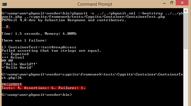
Assertion Failure:
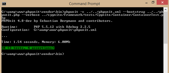
Assertion Success:
PHPunit displays number of assertion, pass, failure, number of tests etc. If any of the tests fails it will display failed in red with method name, reason etc. And on success it will display green with number of assertion, tests etc.
Is it not easy?
Conclusion:
Though there are multiple things to cover, I believe I have given you good introduction of PHPUnit and How to write basic unit tests using PHPUnit.
So, why to be lazy? when you can deliver quality code. Start doing assertions tests on your code for current or future projects. Jump start from here with test driven development. Write code better, testable, modular. I hope this article is useful to you. Please don't forget to share with your friends and leave your comments below.
Keep Visiting.


